Corporate Identity
Hyundai Development Company’s CI symbolizes the harmonization of softness and tension, emptiness and fullness, straight lines and curves based on a geometric framework.
-
Flexible innovation
It symbolizes a changeable and scalable design system based on creative and innovative corporate culture.
-
Expertise in spaces
It symbolizes Hyundai Development Company creating a foundation and living spaces with its own expertise and insight.
-
Robust reliability
It presents the corporate image of reliability and leadership in the industry through basic principles of clarity and simplicity.
- *The logotype design, including its colors and sizes, may not be altered or reproduced partially or arbitrarily in any other forms.
- * Using the original (digital) file without any changes or modifications ensures that the identity of Hyundai Development Company is well maintained.
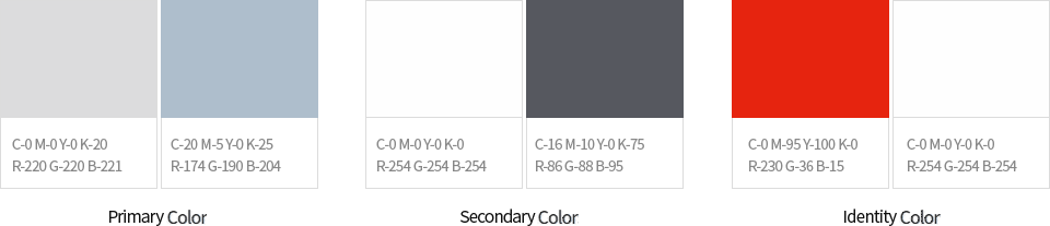
- *Hyundai Development Company’s two core colors are HDC Blue and HDC Grey.
- * They can be applied in two versions—light or dark—for promotional purposes; other colors can be applied depending on various design purposes.